EXECUTIVE SUMMARY

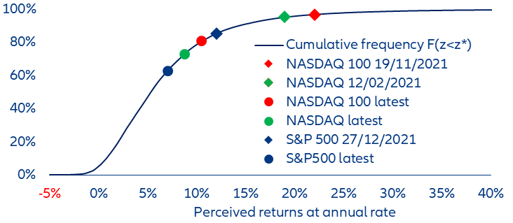
  • Some important segments of the US equity market (the NASDAQ, the NASDAQ 100, the S&P 500 home builders index) were most likely in a bubble mode in 2021; they have not yet completed a typical post-bubble correction, offering more downside than upside.
  • In contrast, equity markets in other advanced economies as well as in emerging markets were not in bubble territory; they now offer more upside than downside.
  • To reach such conclusions, we do not rely on valuation metrics; instead, we use an original methodology that focuses on how past market movements influence investors’ psychology in a context of uncertainty.

Is the current market correction a bona fide bubble-bursting episode? And if so, can it get worse?

Impressive as they may be, the 20-30% corrections experienced in the first half of 2022, the worst first-half drop in more than 50 years, have not come in from the cold. They have instead followed a period of rapid price appreciation; their starting points were elevated ones. Hence, two questions are to be answered: firstly, were the starting points of such corrections so high that markets had become bubbles? Secondly, if markets were in a bubble mode, have they deflated as much as they typically do when a bubble bursts? As always, understanding where we are coming from might help to figure out where we are heading to.

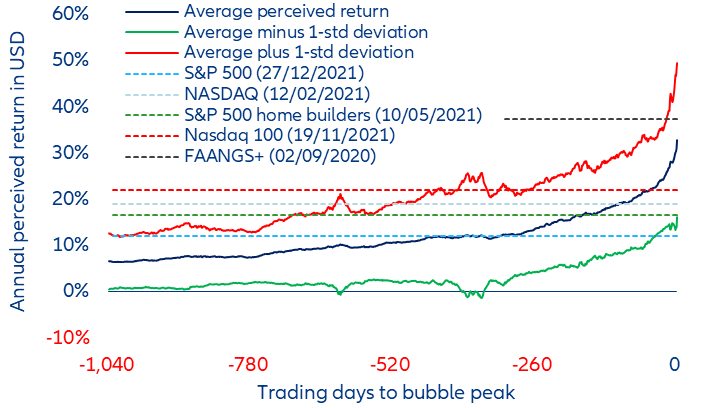
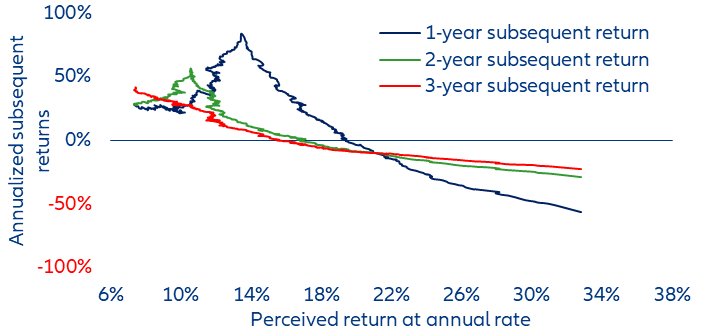
Our answer – namely, yes, some key market segments, mainly in the US, were in a bubble mode, but no, it is not yet time to increase exposure to risky assets – may not be original, but the quantitative method we use to reach it is. As we live in a world of uncertainty (“unknown unknowns”) rather than in a world of risk (“known unknowns”), we assume that fundamental valuation is an elusive notion about which investors cannot form rational expectations. We focus instead on how past market movements influence investors’ psychology. In our framework, a market becomes a bubble when market participants, looking at the sequence of past returns, perceive it to rise at an elevated pace. To measure such a pace, we use a weighted average of past returns, the weighting factors of which possess a unique property: they are time-varying (or context-dependent).  We label this metric the perceived return. To characterize a bubble, we set a threshold of 15% a year for the perceived return.

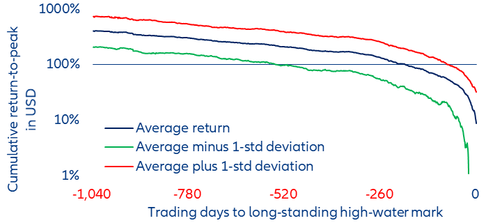
The bubble bursts when the market reaches a level that becomes a long-lasting high-water mark (of at least 260 trading days).  By combining these two criteria – a perceived return in excess of 15% a year when the bubble bursts and a long-lasting high-water mark – and applying them to 44 different markets (equity markets: 22 in advanced economies, 12 in emerging economies; commodities: six; precious metals: three; crypto-currencies: one) in the post-WWII period, we identify almost 100 bubbles (Table 1).[2] The next and final step of our investigation is to assess whether the paths followed by the perceived returns before as well as after these 100 high-water marks exhibit some common patterns or characteristics. We find they do. We use such patterns and characteristics to assess the current situation in capital markets. According to our methodology, some important segments of the US equity market (the NASDAQ, the NASDAQ 100, the S&P 500 home builders index) were most likely in a bubble mode in 2021, and they have not yet completed a typical post-bubble correction. In contrast, equity markets in other advanced economies as well as in emerging markets were not in a bubble mode.

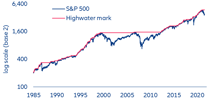
With the benefit of hindsight, it is easy to spot when a bubble has burst: A bubble bursts when it reaches a long-lasting high-water mark. This provides us with is our first bubble criterion (Figure 1).

Figure 1: High-water marks for the S&P 500 1984 to date.

Figure 1: High-water marks for the S&P 500 1984 to date.
Sources: Refinitiv, Allianz Research.

When a market is in a rising trend, it frequently reaches new highs and the pattern is one of higher highs (both the blue line and the red one are rising). From time to time, a new high is not exceeded for a long time because it is followed by a protracted price decline (the blue line falls but the red line becomes horizontal because there is no new high coming). Then, if the red line remains horizontal for more than 260 trading days, the last new high becomes what we call
a long-standing high-water mark.

For example, it took the S&P 500 no less than 6,248 trading days (or 25 years) to rise above the level it had reached on 16 September 1929. As for the Nikkei 225, its high-water mark of 27 December 1989 lasted even longer: 8,099 trading days (or 31 years). A long-lasting high-water mark is the first objective criterion that we shall use to define a bubble. But how long-lasting? At least 260 trading days (i.e. one calendar year). Many activities (including investment performance reporting) follow an annual cycle. As any wrong-footed portfolio manager knows, a year is well long enough to generate “underperformance stress” and lose his or her job.

The July 1990, July 1998 and February 2020 episodes provide examples of short-lived high-water marks. In contrast, March 2000 and October 2007 are examples of long-standing high-water marks.

Our second criterion is a perceived rate of return (in USD) higher than 15% a year at the high-water mark. Now that we can date the end of the bubble and assign it the date 0, we can try – looking backward – to characterize what happens during the journey to its terminal burst, as well as – looking forward – what happens in the wake of its burst. Our working assumption is that the pace at which an asset price inflates might indicate how "bubbly" it is. The challenge, then, is to measure that pace, bearing in mind that, in a bubble episode, the sequence of daily returns is not stationary, but typically follows a parabolic path (Figure 2).

Figure 2: The parabolic path of daily return in a bubble (average of 100 bubbles)

Figure 2: The parabolic path of daily return in a bubble (average of 100 bubbles)
Source: Allianz Research.

Expressed at a daily rate, the (log) return-to-peak is on average not constant during a bubble. 1,040 to 260 trading days before the peak (i.e four to one year before the peak), it increases slowly from 0.15% to 0.25% (or from 37.9% to 87.4% at compounded annual rate); during the last year before the peak, it follows a parabolic path that ends close to 1.5% (equivalent to a 3,866% compounded annual rate).

Our 15% threshold may look somewhat arbitrary. In 1929, the perceived return on the S&P 500 peaked at 12.56% on 03 September. Yet, nine days later, the market peaked and then crashed. In the same vein, the perceived return on the S&P 500 peaked at 12.48% on 25 August 1987, and yet the market crashed in October. Before the Great Financial Crisis, broad indices did not pass our 15% threshold, but some smaller asset classes did: the S&P home builders index in 2005, commodities in 2006-2007, Chinese shares and the FAANGS+ in 2007 (Table 1). However, when we study the distribution of the perceived returns of the 44 markets under investigation, we find that about 90% of our observations are smaller than 15%.

Assuming that past price movements are instrumental in shaping expected returns and thus the market’s psychology, we use a little-known algorithm – the Allais (1965, 1966) filter – to account for the way market participants process past returns, memorize them and compute our perceived return (Appendix I). Its only inputs are the daily (log) returns of the market of interest; we assume that its output, the perceived return – a weighted average of past returns, the weighting factors of which are time-varying (or context-dependent) – does measure the pace at which this market is perceived to rise or to fall. As we compute such perceived return on a daily basis, it is a high-frequency indicator.

Why not use an easier to compute arithmetic average of past daily (log) returns over a fixed timespan?  Because, notwithstanding its pervasive use in the financial industry, an equally weighted average of past returns – irrespective of its (arbitrarily chosen) timespan (why one year? why not five?) – ignores the sequential order of returns. Any reshuffling of the sample returns yields indeed the same arithmetic average. As such, an equally weighted average is unlikely to capture the market participants’ psychology.

Taking the sequential order of past returns into account is what an exponentially weighted moving average (EWMA) of past returns does. It does so by giving less and less weight to the more and more distant past. Going backward in the past, the weights decline exponentially at a constant rate, set between 0 and 1, called the gain or the decay factor. How should we interpret this constant parameter? In either one of the three following ways: as the speed at which people learn from past experience, as the length of their memory or as an elasticity with respect to the latest outcome. Setting the decay factor close to 1 implies that people learn quickly, have a short memory and are very sensitive to the most recent past. A decay factor close to 0 implies the opposite.

But why should the decay factor be constant? Shouldn’t it depend on the context? Increase when the daily returns are in an increasingly steep rising trend, decrease in the opposite situation, in short vary between 0 and 1? By design, the Allais filter’s decay factor has such dynamic properties. As the elasticity of the Allais filter is context-dependent (or time-varying), such a smoothing algorithm is uniquely fit to cope with two features of financial time series: on the one hand, the frequent switches between low and high volatility regimes; on the other hand, the parabolic path typically followed by daily returns when a market closes in on a long-lasting high or low. We believe the perceived return generated by the Allais filter is a plausible measure of irrational (i.e. excessive) exuberance (or despair), when people are faced with uncertainty, rather than risk. By uncertainty, we mean a situation in which people do not even know what cannot happen (unknown unknowns). In plain English, Allais's perceived return implies that during a bubble, people give an increasing weight to the most recent past, so that the past becomes increasingly irrelevant (i.e. the (in)famous "this time, it's different" argument) and the length of their memory shrinks (Figure 3). As a result, their expectations become increasingly exuberant, but also increasingly elastic and versatile.

Figure 3: The varying length of memory

Figure 3: The varying length of memory
Sources: Refinitiv, Allianz Research.

To define bubbles in a quantitative way and investigate their anatomy, we then combine these two quantitative criteria (Figure 4):

  • The high-water mark reached at the peak lasts at least 260 trading days (i.e one year)
  • At the high-water mark, the perceived return stands above 15% a year.

The perceived return cannot peak after the market has reached a high-water mark, because the negative returns posted after the peak can only bring it down (see Appendix 1). But, if the market’s ascent slows down, the perceived return may peak before the high-water mark is reached (as it did in Japan in the late 1980s).

Figure 4: Combining our two criteria: the Hang Seng S&P example from 1964 to 30 June 2022

Figure 4: Combining our two criteria: the Hang Seng S&P example from 1964 to 30 June 2022
Sources: Refinitiv, Allianz Research.

In the case of the Hang Seng index, we identify six bubbles in March 1973, October 1987, January 1994, August 1997, March 2000 and October 2007. For the sake of comparability, we have computed all perceived returns in USD and excluding dividends (for the latter reason, in Germany, we have used the FAZ instead of the DAX index; if the FAZ does not count as a bubble, it is because it narrowly missed our 15% threshold in 1987, 1990, 2000 and 2008).

According to our two criteria, the tally of bubble episodes in equity and commodities markets in the post-WWII era reaches at least 100. Our list of bubbles is most likely not comprehensive because we have by design limited our search to stock market indices and commodities. Except for the FAANGS+, bubbles in specific stocks are therefore out of scope. Bitcoin is shown for the sake of curiosity. The stocks or sectors that led equity markets to record highs in late 2021-early 2022  – the FAANGS, the NASDAQ, the NASDAQ 100, the S&P home builders index – are very likely to increase that number, if they have not already done so (see Table 1).[1] However, the broadest equity market index – the MSCI world – is not as bubbly as it was in 1987 or 2000, but it is as bubbly as in 1973 or 2007.

A remarkable feature of bubbles is visible in Table 1: At the bubble peak, smaller asset classes tend to experience higher perceived returns; in other words, the smaller an asset class, the bigger the bubble. A case in point is the US market in March 2000:  According to our perceived return metrics, the Nasdaq biotech index was bubblier than the NASDAQ 100, which was in turn more exuberant than the NASDAQ, which in turn was bubblier than the S&P 500. At the same time, the perceived return on the MSCI World was only 13.2%.  The same kind of hierarchy is visible in 1989-90 with the Taiwan SE Taiex, the Kospi, the Nikkei 225 and the MSCI world. And the most extreme perceived returns are associated with "small" asset classes: gold and silver in 1980; bitcoin in 2013 and 2017. From such observations, we can infer that an "everything bubble" is unlikely to ever exhibit perceived returns as high as the ones observed for individual bubbles. The theory of rational bubbles sheds some light on such observations.

The challenge of accounting for the large swings of capital markets without jettisoning the rational expectations hypothesis has led to the concept of rational bubbles: in short, a bubble is deemed rational if is sustainable. According to Jean Tirole (1982, 1985), followed by Olivier Blanchard and Stanley Fischer (1989), under certain conditions, it is rational for prices to deviate from fundamental value, especially if assessing such fundamental value is not straightforward. Which are such conditions? They all relate to the sustainability of the deviation from fundamental value.

  • Firstly, current prices must be driven by rational self-confirming expectations about future increases in an asset's price: People must be buying an asset because they expect its price to go up. Under uncertainty, purely rational expectations cannot be formed; expectations à la Allais are more plausible.
  • Secondly, for the asset price not to be capped by a final value, the asset must have an infinite life.
  • Thirdly, to circumvent the fact that each buyer of the assets has a finite life and must be able to resell his holdings, there must be – like in overlapping generation models – an infinite supply of agents with finite life: the population of potential buyers needs to be constantly rejuvenated.
  • Last but not the least, to remain affordable, the bubble’s expected rate of return must remain lower than the expected rate of growth of the economy.

As pointed out by Jean Tirole (2017), it is not easy to apply the theory of rational bubbles to the real world because it involves not directly observable expectations. But its key messages are compatible with the observations we report. A bubble is more likely to inflate when an asset: 

  • is hard to evaluate (who knows the value of Bitcoin?) and uncertainty rules
  • has an infinite life (bonds do not rise as much and as fast as equities)
  • appreciates at a slower pace than income (when bubbles burst, the ratio of their market capitalization to aggregate income is typically high)
  • and when the population of potential buyers is young and growing (Japan was much younger in the 1980’s than it is today).

What about fundamentals? An influential branch of academic research suggests that it is hard, if not impossible, to explain the volatility of financial markets in terms of “fundamentals”. Building on the works of Irving Fisher (1932) and Hyman Minsky (1986), as well as on his study of financial history, Charles Kindleberger (1978) sees common patterns in different episodes of manias, panics and crashes (see Appendix II). He finds those episodes hard to reconcile with the rational REH. In his view, they provide evidence of a positive feedback loop between price movements and the demand for assets, but he doesn’t attempt to quantitatively model non-rational expectations. Robert Shiller (1981) has shown that equity prices move too much to be justified by subsequent changes in dividends. The experimental work of Caginalp, Porter and Vernon Smith (2000) on asset markets shows that people are prone to inflate bubbles, even when they are endowed with perfect information about the "fundamental value" of an asset with a finite life. Vernon Smith explains such observations by the lingering uncertainty about other market participants' behavior, the expectations of which he models with an exponentially weighted moving average (EWMA) of past returns. For Guesnerie (2001, 2005), “it is not obvious to say the least, to explain actual stock markets’ fluctuations using dynamic models that adopt some (not too loose) version of the REH”. And, according to Phelps and Frydman (2013), “nowhere have the REH’s epistemological flaws and empirical disappointments been more apparent than in efforts to model financial market outcomes”.

What can we learn from what happened to perceived returns before and after these bubbles burst?

Figure 5 describes the average path of the perceived return (the blue line) in our 100 bubbles.[3] The red and green lines also show the dispersion around the average. Finally, the horizontal dotted lines show the most recent level of the perceived returns on some US indices and the FAANGS+.

Figure 5: The average path followed by the perceived return prior to a bubble peak

Figure 5: The average path followed by the perceived return prior to a bubble peak
Sources: Refinitiv, Allianz Research.

Figure 5 suggests some important observations:

  • Four to one year before the peak, the average perceived (log) return increases slowly from 9.4% to 15.7%, a number already much higher than the trend growth rate of nominal GDP and the prevailing rate of interest.
  • In the last year before the peak, the average perceived (log) return increases to 30.5% a year (at this rate, prices double every two years and three months).
  • In the last year before the peak, the dispersion around the average perceived (log) return increases from 7.9% to 16.7% (an observation already foreshadowed by the dispersion around the average return-to-peak shown in Figure 4)
  • Neither the S&P 500 nor the S&P 500 home builders index (a proxy for the US housing market) was in the final year of a typical bubble but – with perceived (log) returns of 11.8% and 14.1% – they were both close to it.
  • In contrast, the NASDAQ, the NASDAQ 100 and a capitalization-weighted index of the FAANGS+ (i.e the FAANGS plus Microsoft) – with perceived (log) returns of 18.6%, 21.6% and 25.6%, respectively – might well have been less than six months from their peaks
  • Neither Tesla nor Bitcoin can fit in Figure 5 because their perceived returns – 145.6% and 75.3% – are simply off the chart.

Keynes reportedly coined the famous quip according to which "markets can remain irrational for longer than you can stay solvent". Figure 6 illustrates the dilemma facing an investor having qualms about the mindset of other investors: During the last year before the peak, prices on average double (the cumulative return to peak is close to 90%); during the last six months, the average cumulative return is still close to 50%; during the last three months, it still is 35%. In other words, the opportunity cost of an early exit is very high and may represent too high a business risk for the bulk of portfolio managers, tied as they are with benchmarks and relative performances.

Figure 6: The cost of an early exit

Figure 6: The cost of an early exit
Sources: Refinitiv, Allianz Research.

The typical path followed by the perceived return past a bubble peak suggests that the current correction has still not run its full course. In Figure 7, we plot the average path followed by the perceived return to the post-bubble low (i.e the lowest price level between two consecutive bubbles). In the wake of a bubble burst, a market typically hits a bottom when the perceived return falls close to 2-3%. As of 30 June, the perceived returns of the NASDAQ 100 (10.8%), the NASDAQ (9.1%) and the S&P 500 (7.3%) were still substantially above this level of 2-3%.

Figure 7: The average path followed by the perceived return past a bubble peak

Figure 7: The average path followed by the perceived return past a bubble peak
Sources: Refinitiv, Allianz Research.

It would still take some large price falls to push the perceived return down to the level typically associated with a market trough. To reach this conclusion, we simulate the path followed by the perceived return under different assumptions of average realized monthly return (see Figure 8). A cumulative realized return of only -10% over two years (i.e an average monthly return of -0.44%) would only push the perceived return down from 11% to 7% (see green continuous line). To push it down from 11% to 2% over two years, a cumulative realized return of -50% (i.e an average monthly return of -2.85%) would be needed.

Figure 8: Perceived return simulations

Figure 8: Perceived return simulations
Sources: Refinitiv, Allianz Research.

Such orders of magnitude are consistent with the average return typically observed during the one- to three-year timespan following the time when the perceived return has reached a certain level (Figure 9). Once the perceived return reaches a level of 18-20%, the average annual return during the subsequent two or three years is close to 20-30%.

Figure 9: When a bubble bursts, it hurts

Figure 9: When a bubble bursts, it hurts
Sources: Refinitiv, Allianz Research.

From a risk management and financial stability point of view, the cumulative distribution of the perceived return indicates whether an asset class entails more downside risk than upside potential.  The cumulative distribution of perceived returns shows that some perceived return values are indeed more frequent than others (Figure 10). At each level of the perceived return, one can estimate whether the distribution of potential outcomes is skewed or not.   

For example, a little less than 10% of our almost 450,000 daily observations are greater than our 15% criterion. Put differently, there is only one chance out of ten to observe a perceived return higher than 15%, while there are nine chances out of ten of observing a perceived return lower than 15%: the ratio of the upside-to-downside probability is therefore 1-to-9. While a risk-averse decision maker may conclude that such an odds ratio is too low (or that its inverse is too high) to remain (fully) invested (to say the least), a risk-seeking decision maker may still be enticed by the small probability of a large gain. He or she should however be aware that the perceived return being in the end an average, it can only increase if it is fed with fresh outcomes greater than the latest perceived return and therefore ever increasing (see Appendix 1). Under such a scenario, the elasticity of the perceived return would simultaneously rise. As a result, the bubble inflation process would become increasingly challenging and potentially unstable. Such dynamics probably explain why the perceived return tends to peak before prices: a mere slowdown in the pace of the market’s ascent is enough to dent the perceived return (as well as market participants’ bullishness). Conversely, when the perceived return falls into the low single digit zone, its elasticity is low and increasingly large drawdowns are required to push it further down. This explains why the perceived return falls below 1% so rarely (less than 10% of our observations). As already said, we are not there yet.

Figure 10: Cumulative distribution of the perceived return

Figure 10: Cumulative distribution of the perceived return
Sources: Refinitiv, Allianz Research.
Allianz Trade is the worldwide leader of credit insurer in trade credit insurance and offers expert solutions such as accounts receivable insurance, business debt collection, bad debt, trade credit, trade credit management, cash flow management, xol, debtor insurance, collect overdue payments, late payments and unpaid invoices. Our mission is to help customers globally to avoid trade risk, trade wisely and develop their business safely.
I'm new to trade credit insurance and want to learn how it works.
I want to protect my business with insurance but unsure about the cost.
Learn more about Economic & Trade Risk Insights